News
Biweekly newsletter no. 11
Token Terminal
•
Why the price to sales ratio (P/S) is a useful tool for crypto investors
The price to sales ratio compares a protocol’s market cap to its revenues. A low ratio could imply that the protocol is undervalued and vice versa. The price to sales ratio is an ideal valuation method especially for early-stage protocols, which often have little or no net income (because the revenue is reinvested into growth, often by subsidizing the use of the protocol’s service).
We’re currently in a historically unique position, with early-stage and high-growth startups operating transparently on-chain. For investors, this transparency means that it’s easier to sort out protocols with meaningful usage relative to their market cap.
We believe that the price to sales ratio offers a highly useful and accurate tool for relative analysis between different early-stage crypto protocols.
- What is in the picture? Top applications (L2) from Token Terminal sorted based on the price to sales (P/S) ratio.
- Why is it interesting? MakerDAO has gone from a high P/S ratio to #3 in a matter of months after raising the stability fees (interest payable) for DAI. Also, two currently similar AMMs (Uniswap and SushiSwap) exhibit the lowest P/S ratios.
A historical perspective
The P/S ratio is calculated by dividing a project’s fully-diluted market cap by its annualized revenues. The metric itself does not directly tell us about the growth patterns in a protocol’s market cap or revenues.
Uniswap
- What is in the picture? Uniswap’s historical price to sales (P/S) ratio (right Y-axis) and market cap (left Y-axis).
- Why is it interesting? There seems to be a pretty direct correlation between the (low) P/S ratio and market cap. This would indicate that Uniswap’s revenues have stayed consistently high since the launch of the $UNI token.
- What is in the picture? Uniswap’s historical price to sales (P/S) ratio (right Y-axis) and daily total revenue (left Y-axis).
- Why is it interesting? This chart shows that Uniswap’s daily revenues have been consistently high during Q3-Q4, which means that fluctuations in the market cap have been the primary driver for the changes in the P/S ratio.
Sushiswap
- What is in the picture? Sushiswap’s historical price to sales (P/S) ratio (right Y-axis) and market cap (left Y-axis).
- Why is it interesting? There does not seem to be a direct correlation between the (low) P/S ratio and market cap.
- What is in the picture? Sushiswap’s historical price to sales (P/S) ratio (right Y-axis) and daily total revenue (left Y-axis).
- Why is it interesting? This chart shows how the surges in Sushiswap’s daily revenues have trended its P/S ratio lower both during its launch and also recently.
Compound
- What is in the picture? Compound’s historical price to sales (P/S) ratio (right Y-axis) and market cap (left Y-axis).
- Why is it interesting? Compound’s market cap has stayed relatively stable since the launch of the $COMP token. On the other hand, its P/S ratio trended quickly to a low double-digit figure after the launch of the token. This would indicate that the revenues of Compound increased significantly immediately after the launch of its token.
- What is in the picture? Compound’s historical price to sales (P/S) ratio (right Y-axis) and daily total revenue (left Y-axis).
- Why is it interesting? This chart shows how Compound’s daily revenues spiked up significantly with the launch of the $COMP token and associated liquidity mining (token incentive subsidy for the users of Compound).
Kyber
- What is in the picture? Kyber’s historical price to sales (P/S) ratio (right Y-axis) and market cap (left Y-axis).
- Why is it interesting? There seems to have been a pretty direct correlation between the P/S ratio and market cap during the early days of Kyber. This would indicate that revenues stayed relatively stable (low) in the early days and have been on an upward trend since.
- What is in the picture? Kyber’s historical price to sales (P/S) ratio (right Y-axis) and daily total revenue (left Y-axis).
- Why is it interesting? This chart shows that Kyber’s daily revenues were relatively non-existent in the beginning but have been on an upward trend for the past two years.
Synthetix
- What is in the picture? Synthetix’s historical price to sales (P/S) ratio (right Y-axis) and market cap (left Y-axis).
- Why is it interesting? After the launch of Synthetix v2, the protocol started off with a relatively low market cap and a high P/S ratio, which would indicate that the revenues were low in the beginning and have trended upward during the past quarter.
- What is in the picture? Synthetix’s historical price to sales (P/S) ratio (right Y-axis) and daily total revenue (left Y-axis).
- Why is it interesting? This chart shows that Synthetix’s daily revenues have been been on an upward trend during Q3-Q4, after a slower start in Q2.
Ethereum
- What is in the picture? Ethereum’s historical price to sales (P/S) ratio (right Y-axis) and market cap (left Y-axis).
- Why is it interesting? The market cap of Ethereum is still a long way from the highs of 2017, yet its P/S ratio has over the past six months trended on par with some of the leading DeFi protocols. This would indicate a significant growth in revenues during the past six months.
- What is in the picture? Ethereum’s historical price to sales (P/S) ratio (right Y-axis) and daily total revenue (left Y-axis).
- Why is it interesting? This chart shows that Ethereum’s daily revenues have been consistently high during Q2-Q4, with the market cap yet to catch-up with the growth in the Ethereum ecosystem.
Token Terminal Smart Beta Index (TTI)
- What is in the picture? The performance of Token Terminal’s price to sales ratio-weighted index.
- Why is it interesting? It’s one of the first fundamentals-based indexes in the crypto market.
- What is in the picture? The historical composition of the TTI index.
- Why is it interesting? It shows that Compound, Uniswap, and MakerDAO currently hold the largest weightings in the index portfolio.
We recently posted a proposal for the TTI to be included in the Index Coop product offering — you can view the proposal here.
Contribute to our Gitcoinhere!
The authors of this content, or members, affiliates, or stakeholders of Token Terminal may be participating or are invested in protocols or tokens mentioned herein. The foregoing statement acts as a disclosure of potential conflicts of interest and is not a recommendation to purchase or invest in any token or participate in any protocol. Token Terminal does not recommend any particular course of action in relation to any token or protocol. The content herein is meant purely for educational and informational purposes only, and should not be relied upon as financial, investment, legal, tax or any other professional or other advice. None of the content and information herein is presented to induce or to attempt to induce any reader or other person to buy, sell or hold any token or participate in any protocol or enter into, or offer to enter into, any agreement for or with a view to buying or selling any token or participating in any protocol. Statements made herein (including statements of opinion, if any) are wholly generic and not tailored to take into account the personal needs and unique circumstances of any reader or any other person. Readers are strongly urged to exercise caution and have regard to their own personal needs and circumstances before making any decision to buy or sell any token or participate in any protocol. Observations and views expressed herein may be changed by Token Terminal at any time without notice. Token Terminal accepts no liability whatsoever for any losses or liabilities arising from the use of or reliance on any of this content.
Stay in the loop
Join our mailing list to get the latest insights!
Continue reading
Customer stories: Token Terminal’s Data Partnership with Linea
Through its partnership with Token Terminal, Linea turns transparency into a competitive advantage and continues to build trust with its growing community.
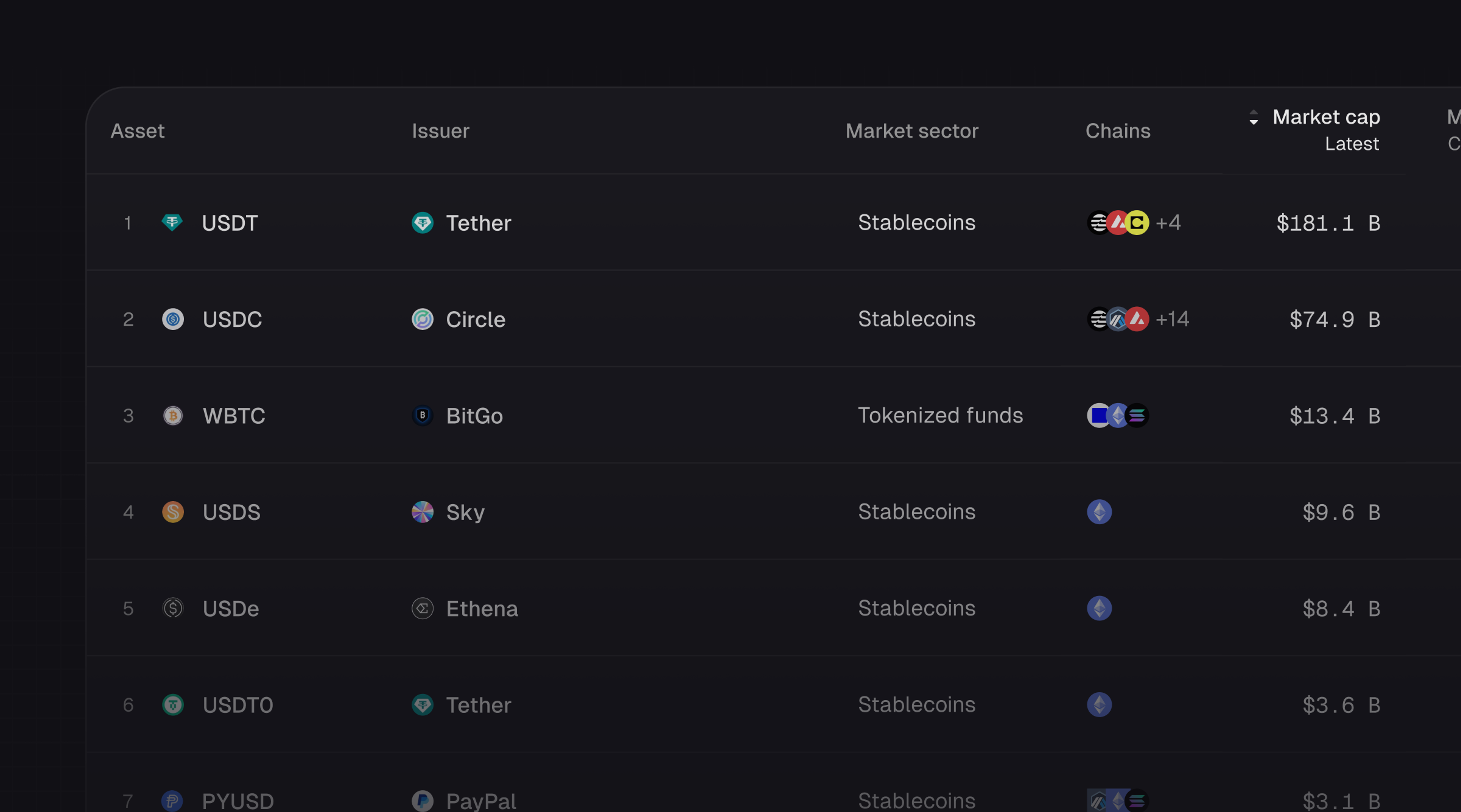
Introducing Tokenized Assets
Token Terminal is expanding its standardized onchain analytics to cover the rapidly growing category of tokenized real-world assets (RWAs) – starting with stablecoins, tokenized funds, and tokenized stocks.
Customer stories: Token Terminal’s Data Partnership with EigenCloud
Through its partnership with Token Terminal, EigenCloud turns transparency into a competitive advantage and continues to build trust with its growing community.