Creating charts
The first step in building a chart is configuring the data you want to visualize. You can use the left-hand panel to select the metric, filters, groupings, and chart type you want to use. In the chart view, you can finalize the chart by selecting the title, description, footnote, time range, and granularity of the data.Metric
First, select one of our metrics. Once you’ve selected a metric, the other filters will update to only show options available for that metric. For instance, if you select Active loans, you will only see projects associated with the Lending market sector.Filters
Next, you can filter by one of following options:- Project: Any project tracked by Token Terminal.
- Market sector: Any market sector associated with a project.
- Chain deployed on: All apps that have deployed on the selected chain.
- Product: Any product line of a project.
Group by
Next, you can aggregate the data by one of the following options:- Project: Aggregate the data by project, e.g. Aave.
- Market sector: Aggregate the data by market sector, e.g. Lending.
- Chain: Split the data by chain, e.g. Ethereum, Arbitrum One, Avalanche.
- Product: Split the data by product line, e.g. Aave v2, Aave v3, and GHO.
- Project & product: Split the data by project and product line.
- Project & chain: Split the data by project and chain.
- Product & chain: Split the data by product line and chain, e.g. Aave v3 on Ethereum, Aave v3 on Arbitrum One, and Aave v3 on Avalanche.
Chart type
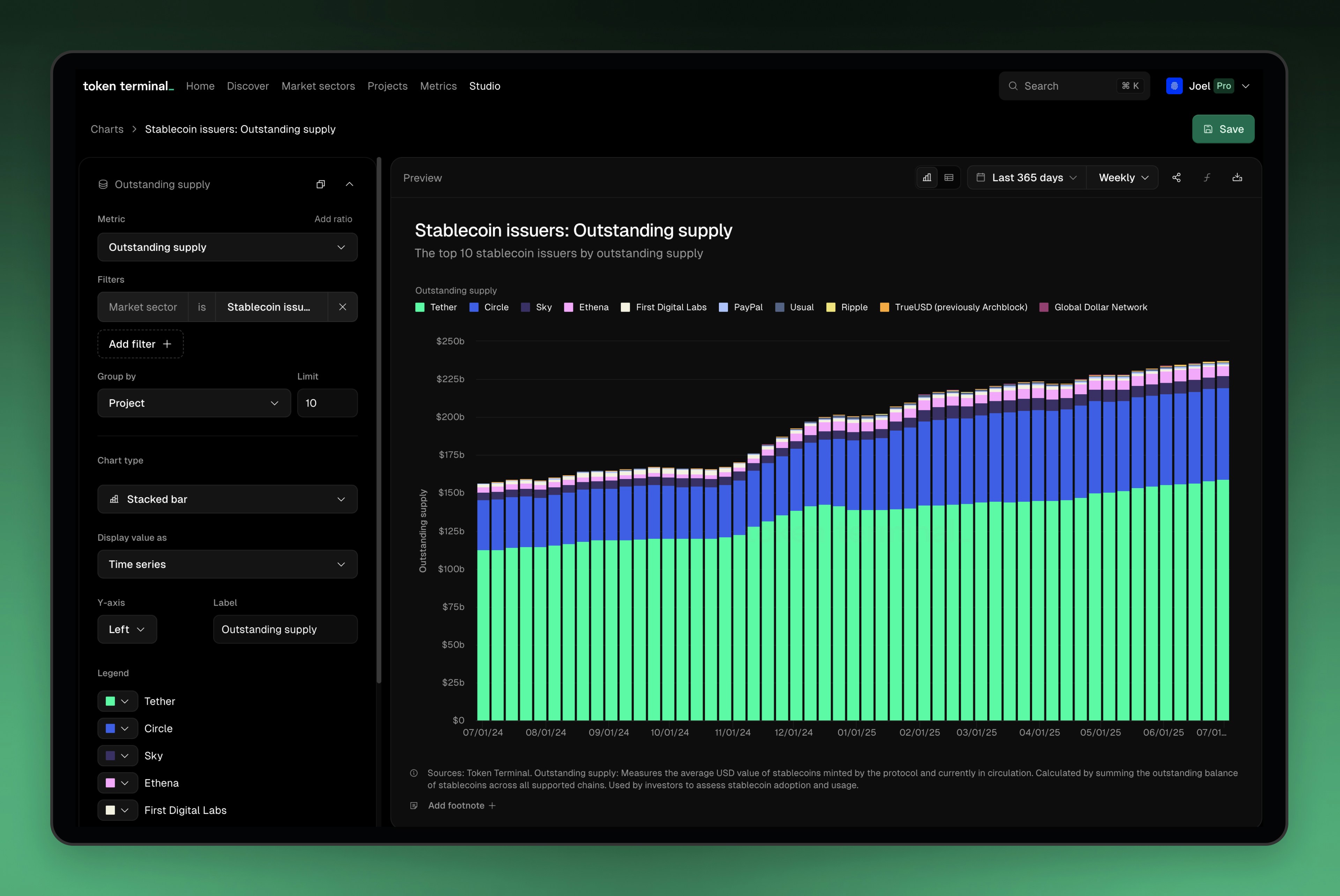
Once you’ve selected your filters and aggregations, you can configure the chart to your liking:- Bar: A standard bar chart that shows the data for each date unit.
- Stacked bar: A standard stacked bar chart that shows the data for each date unit, with each grouping stacked on top of each other.
- Line: A standard line chart that shows the data for each date unit.
- Area: A standard area chart that shows the data for each date unit.
- Stacked area: A standard stacked area chart that shows the data for each date unit, with each grouping stacked on top of each other.
- Number: These will change your Group by setting to “None” and will aggregate the data into a single value for the selected date range.
Display value as
You can choose how the data is displayed in the chart. Options include:- Time series (default) - data for each day is shown as a total value for only the date unit of that metric.
- Cumulative - data is summed up day over day up until the latest date.
- Percent share - data is split between groupings within the data adding up to 100% per day/week/month/quarter.
Y-axis
Choose where the axis is located and what label should be applied for the metric.Label
Choose the label for the chart. This will be used in the legend when added to a dashboard.Legend
Choose the colors for each of the legend items. Use our default palette, select a common brand color, or choose a custom color for each item.Adding multiple metrics
You can add additional metrics to your charts by clicking the Add metric button at the bottom of the left hand panel. Each metric will be displayed on the same chart with whatever unique settings you add for that metric.Title & description
You can add add a title and description to your chart. Both will be displayed with the data when the chart is added to a dashboard or shared with others.Footnote
Footnotes are a great way to add additional context to your chart. You can use footnotes to explain the methodology behind the chart, provide links to sources, or add any other relevant information.Working with charts
After you’ve saved the chart, you have a number of options for working with your charts. You can also find the chart in your library under the Charts tab.Share
You can share your chart with others by clicking the Share button in the top right corner of the chart editor. This will generate a unique URL that you can share with anyone.Clone
You can clone any Studio chart on Token Terminal, whether it’s from your team or not. Clicking Clone will open up the chart editor with a fresh copy of the chart that you can now adapt for your own needs.Preview
With Preview, you can see how your chart will look when added to a dashboard. This is a great way to check that your chart is configured correctly before adding it to a dashboard.Copy as image
You can copy your chart as an image by clicking the Copy as image button in the top right corner of the chart editor. This will copy the chart to your clipboard, which you can then paste into any document or image editor. This is a great way to share your chart with others in social media or to use it in presentations. We offer three options for copying your chart as an image:- Default: This will copy the chart as it is displayed in the editor.
- Social media: This will copy the chart in a format optimized for social media, with a square aspect ratio and a smaller size.
- Slide deck: This will copy the chart in a format optimized for slide decks, with a brand colored background.